Thanks to the work of pseudo-anonymous figure Satoshi Nakamoto, Bitcoin (BTC) and the iconic Bitcoin logo graced the world of technology for the first time back in 2009.
Whilst those looking for an in-depth exploration of the world’s leading cryptocurrency can do so by visiting this page, this particular article will be taking you through the journey of its notorious ‘orange B’ logo.
In its fourteen years of existence, the Bitcoin logo has undergone two updates. In both alterations, design teams subtly tweaked its graphics in order to underscore the significance of the digital asset it represented.
The Original Bitcoin Logo - 2009
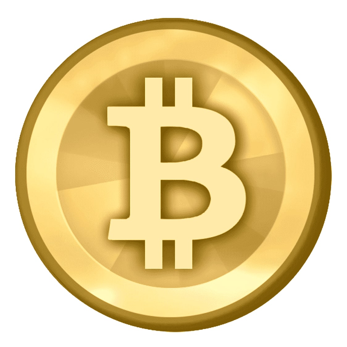
Satoshi Nakamoto disclosed the first Bitcoin logo back on January 9th, 2009. As you can see below, it sported a simple gold coin design with the letters ‘BC’ engraved on it.

When it comes to its practical purpose, its coin-like imagery did a succinct job at depicting Bitcoin’s cryptocurrency stature - a technological concept that would’ve felt completely alien to many people back in 2009.
However as of today, this particular logo edition now looks rather ‘stocky’ and primitive - therefore making it somewhat ‘so 2009’.
The First Bitcoin Logo Alteration - February 2010
The first Bitcoin logo alteration then came in February 2010.
Whilst still sporting a ‘gold coin’ premise, a substantial change was made through the engraved ‘BC’ being replaced by a dollar-inspired ‘B’.
However in contrast to the US dollar or the Euro, the new Bitcoin ‘B’ exhibited two strokes that only diverged from the top and bottom of the letter. Such alterations were made based on community feedback, with Satoshi also releasing the copyright-free images into the public domain.
The Second Bitcoin Logo Alteration - November 2010
A more monumental change to the Bitcoin logo then came in November of the same year. The mastermind behind the almighty transformation was Bitcoin community member ‘Bitboy’ - not to be confused with controversial YouTuber ‘BitBoy Crypto’.
Coming in response to the first change’s mixed reception, the Bitboy-built design scrapped its real-life coin aesthetic whilst still keeping its circle shape.
With some suggesting that its use of an orange circle was inspired by the MasterCard logo, Bitboy opted to rotate its ‘B’ symbol 14% clockwise, whilst making it white.

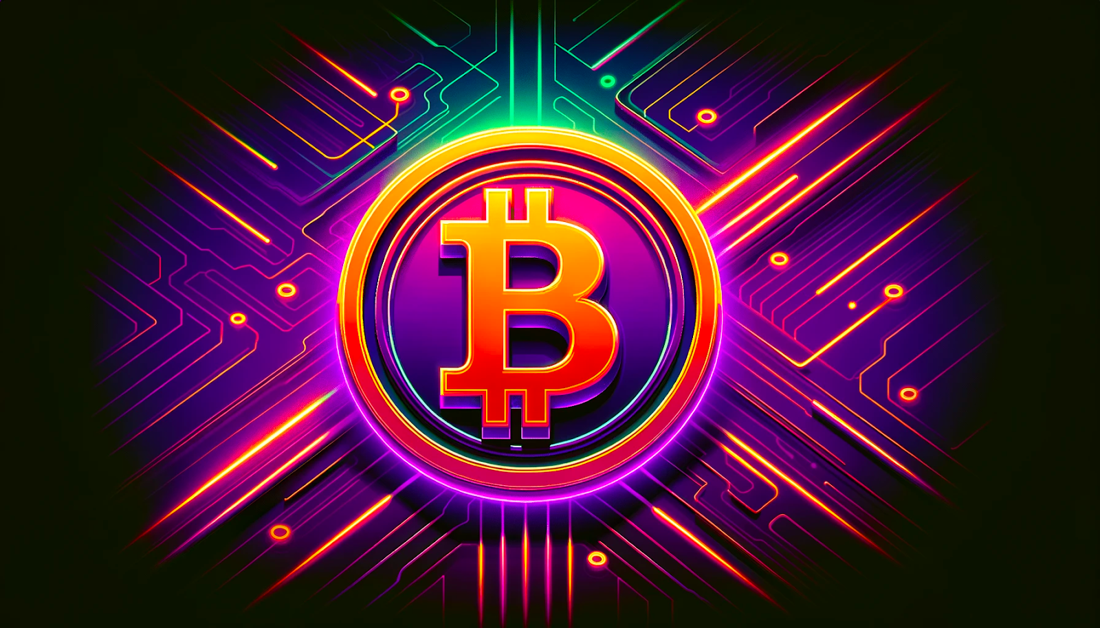
This is the same Bitcoin logo design that we see today, with the orange ‘B’ even featuring as a branded emoji on Elon Musk’s X.
$42,228.20#Bitcoin #BTC $BTC $USD
— Bitcoin (@Bitcoin) December 14, 2023
The Significance & Success of the Bitcoin Logo
Whilst the precise success of a brand’s logo can be studied by the likes of marketing departments, here’s five reasons as to why this third edition of the Bitcoin logo has served the OG cryptocurrency so well.
Simplicity: Successful companies often opt for straightforward business logos, and the Bitcoin logo follows suit. In short, its clean and uncluttered design contributes to its effectiveness, as with a simple design comes seamless recognition.
Attractiveness: Thanks to a well-balanced and vibrant colour scheme, along with a stylised ‘B,’ the aesthetics of the Bitcoin logo are visually appealing, This visual allure creates a positive and approachable impression, encouraging users to engage and learn more about the brand.
Uniqueness: In a fiercely competitive market, a distinctive logo is crucial for standing out. The Bitcoin logo achieves this through its incredibly simple - and to-the-point - design, as it ensures that there’s no confusion with other brands.
Versatility: Given the dynamic nature of marketing strategies, having a logo that adapts to changing trends is vital. Here, the Bitcoin logo fits the bill through being recognised as a versatile design that can be seamlessly applied to various marketing mediums.
Relevancy: Aligning a logo with its audience and market is essential. The Bitcoin logo excels in this aspect, as its ‘B’ design is explicitly tied to the ’stripped’ designs of the dollar and euro (etc.).
The Bitcoin Logo - FAQ
What is the real story behind Bitcoin?
Bitcoin is the world’s inaugural cryptocurrency, and it currently holds the distinction of being the most valuable and widely recognised digital currency of them all.
It was launched in January 2009, with its inception being attributed to a computer programmer/group of programmers operating under the pseudonym Satoshi Nakamoto (with the true identity remaining unverified to date).
Who designed the Bitcoin symbol ₿?
Satoshi Nakamoto created the first ‘golden lettered’ Bitcoin logo, which was released on January 9th, 2009.
That being said, the version that we see together was designed by Bitcoin community member ‘Bitboy’ in November 2010.
Does anyone own the Bitcoin logo?
The image and logo of Bitcoin are widely available and used, and there is no one person or organisation that can claim exclusive ownership or control over them.
How did Bitcoin become worth money?
The value of Bitcoin is derived from its users and their respective supply and demand levels for it.
As long as it retains the essential characteristics associated with currency and continues to be in demand, Bitcoin will persist as a medium of exchange, store of value, and speculative avenue for investors.
Who runs Bitcoin?
Bitcoin operates without centralised control from any individual or group.
Instead, it’s overseen by a set of stakeholders, including developers, miners, and users. Here, developers contribute by writing the code that facilitates Bitcoin's functioning, miners verify transactions, and users actively engage with the software through trading, transactions, holding, and other activities. This decentralised structure is fundamental to Bitcoin's resilience and independence.
Want More Cutting-Edge Crypto News?
Follow Us: X TikTok Instagram Telegram LinkedIn
Sign up to our newsletter at the bottom of the page
Check Out Our Top 10 Crypto Currencies of 2023
This article is intended for educational purposes and is not financial advice.